The interactive usage chart gives you an overall or detailed view of users over a specified time period.
Use the interactive chart to slide and dice the data about your app. Find out who is using your app, including device, country, type of user, and many other facets.
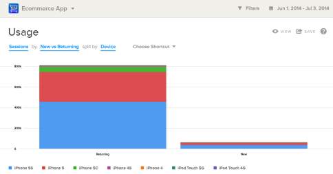
To demonstrate one of the ways you can get detailed information, this procedure sets the chart to display whether new users are using new devices or not.
-
Add a split for Device.
The chart displays the comparison between new and returning users, divided by type of device.